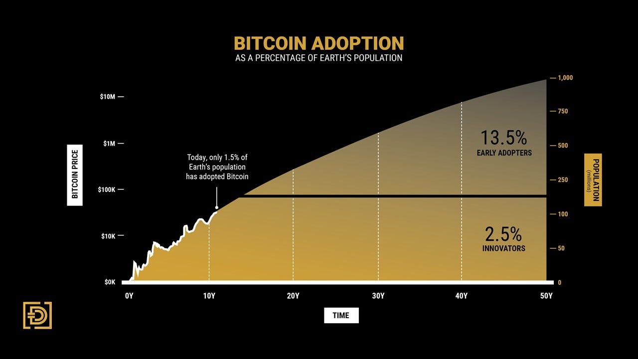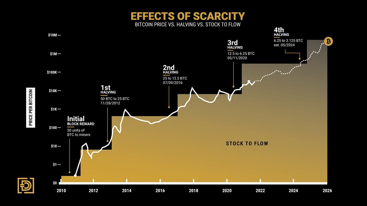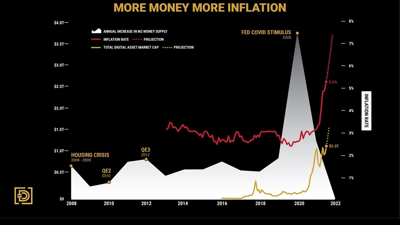
This edition is different from our typical investment thoughts as we want to share with you our latest investment presentation. In it you will find a range of information that covers education to future price possibilities. There are a few custom charts we built that will catch your eye. The Bitcoin Adoption chart overlays Bitcoin’s price history over an Innovation Adoption Lifecycle that shows that there is still a long way to go before the average person holds Digital Assets. The chart shows that global adoption would need to increase by 49% just to get to the halfway point. The Effects Of Scarcity graph shows how scarcity and the diminishing block reward both push the price of Bitcoin up in steps, and how high the price can go as BTC continues to follow the path. More Money, More Inflation has quickly become our favorite chart reflecting how money printing is leading to inflation and to an increase in the digital asset market cap. These examples are just a sample of what you can expect to find, so please read through, enjoy, and let us know if you have any questions.
